Introduction
The compose_*() family assembles multiple
plotit objects into multi-panel layouts. Unlike
split_*() (which splits one dataset across facets),
compose_*() combines independent plots —
each can have different data, geometries, scales, and coordinate
systems.
Three composers are available:
| Function | Layout |
|---|---|
compose_grid() |
Grid of plots (rows × columns) |
compose_inset() |
Floating overlay on a base plot |
compose_marginal() |
Scatter + marginal distributions |
All return a plotit_composite object that pipes
seamlessly into label_*(), style(), and
export().
compose_grid() — Grid Layout
Arrange any number of plots into a grid. By default, plots stack
vertically (ncol = 1).
Basic Grid
p1 <- iris |>
  plotit(encode(x = Sepal.Width, y = Sepal.Length, colour = Species)) |>
  mark_point(size = 2, alpha = 0.7) |>
  scale_color(range = "viridis")
#> Scale for colour is already present.
#> Adding another scale for colour, which will replace the existing scale.

p2 <- iris |>
  plotit(encode(x = Species, y = Sepal.Length, fill = Species)) |>
  mark_boxplot() |>
  scale_fill(range = "brewer")
#> Scale for fill is already present.
#> Adding another scale for fill, which will replace the existing scale.

compose_grid(p1, p2) |>
  label_title("Iris Dataset Overview")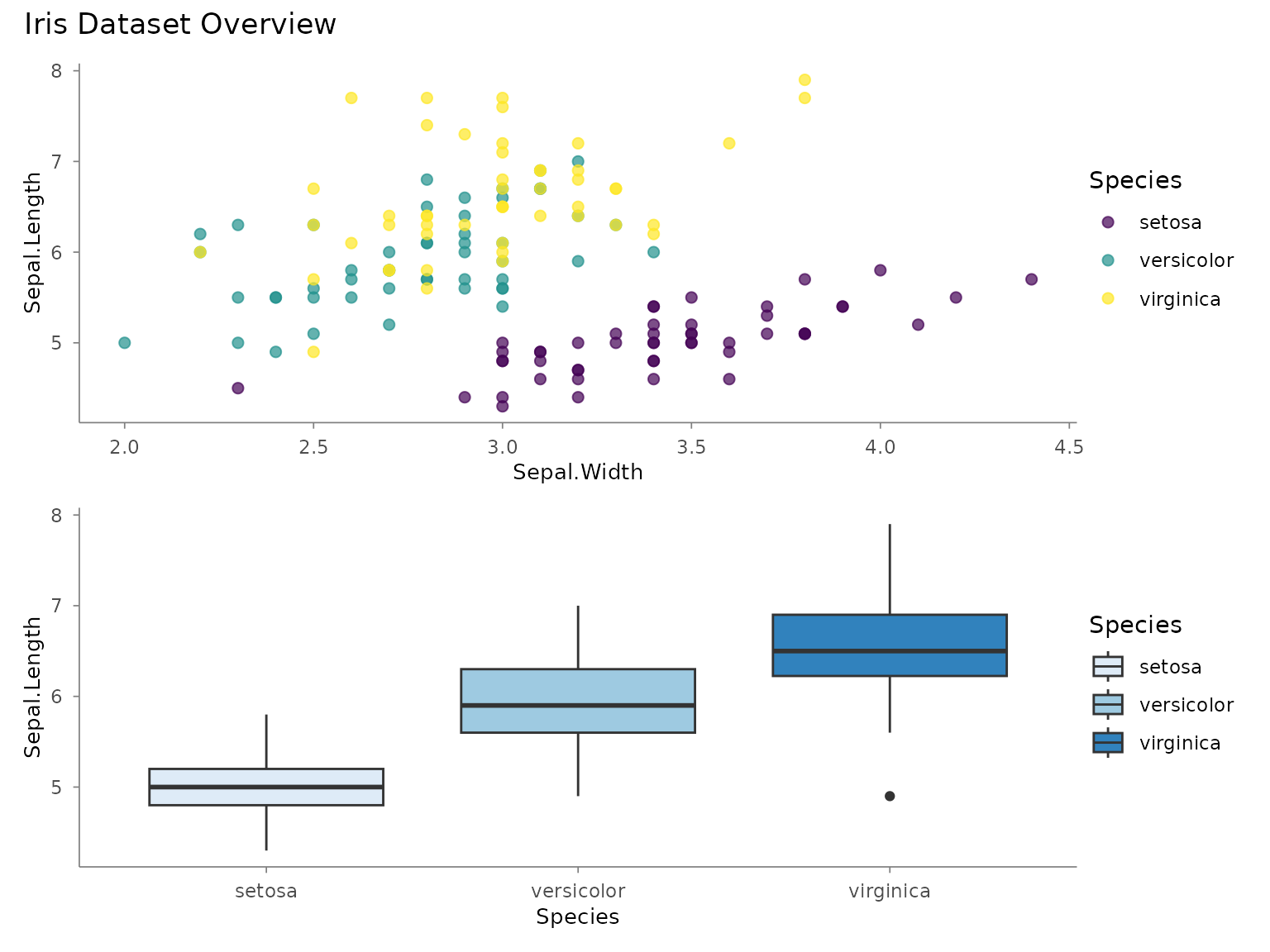
Custom Layout
Control columns, rows, and relative sizes with ncol,
nrow, widths, and heights:
p1 <- mtcars |>
  plotit(encode(x = wt, y = mpg, colour = factor(cyl))) |>
  mark_point(size = 2) |>
  scale_color(range = "brewer") |>
  label_title("Weight vs MPG")

p2 <- mtcars |>
  plotit(encode(x = factor(cyl))) |>
  mark_bar() |>
  label_title("Cylinder Count")

p3 <- mtcars |>
  plotit(encode(x = hp, y = mpg, colour = factor(cyl))) |>
  mark_point(size = 2) |>
  scale_color(range = "brewer") |>
  label_title("Horsepower vs MPG")

p4 <- mtcars |>
  plotit(encode(x = factor(gear), y = mpg)) |>
  mark_boxplot() |>
  label_title("Gears vs MPG")

# 2×2 grid, first column twice as wide
compose_grid(p1, p2, p3, p4, ncol = 2, widths = c(2, 1)) |>
  label_title("mtcars Dashboard") |>
  label_caption("Source: Motor Trend, 1974")
Shared Axes and Guides
p1 <- iris |>
  plotit(encode(x = Sepal.Width, y = Sepal.Length, colour = Species)) |>
  mark_point(alpha = 0.6) |>
  scale_color(range = "viridis")
#> Scale for colour is already present.
#> Adding another scale for colour, which will replace the existing scale.

p2 <- iris |>
  plotit(encode(x = Petal.Width, y = Petal.Length, colour = Species)) |>
  mark_point(alpha = 0.6) |>
  scale_color(range = "viridis")
#> Scale for colour is already present.
#> Adding another scale for colour, which will replace the existing scale.

# Shared legend, shared axes
compose_grid(p1, p2, ncol = 2, guides = "collect", axes = "collect") |>
  label_title("Sepal vs Petal Measurements")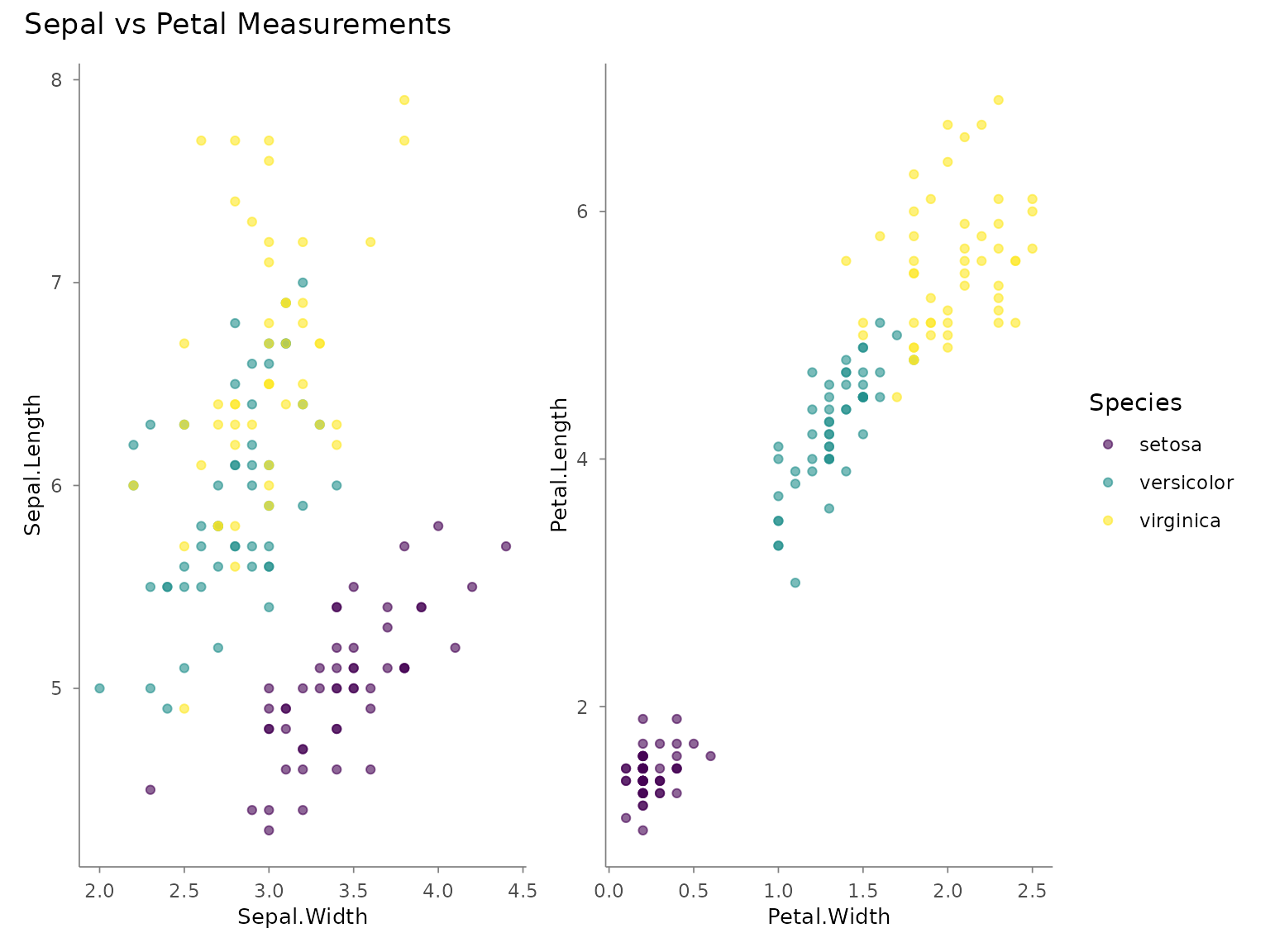
Sub-Figure Tags
Use tag_levels to auto-label sub-figures:
compose_grid(p1, p2, ncol = 2, tag_levels = "A") |>
  label_title("Comparison of Iris Measurements")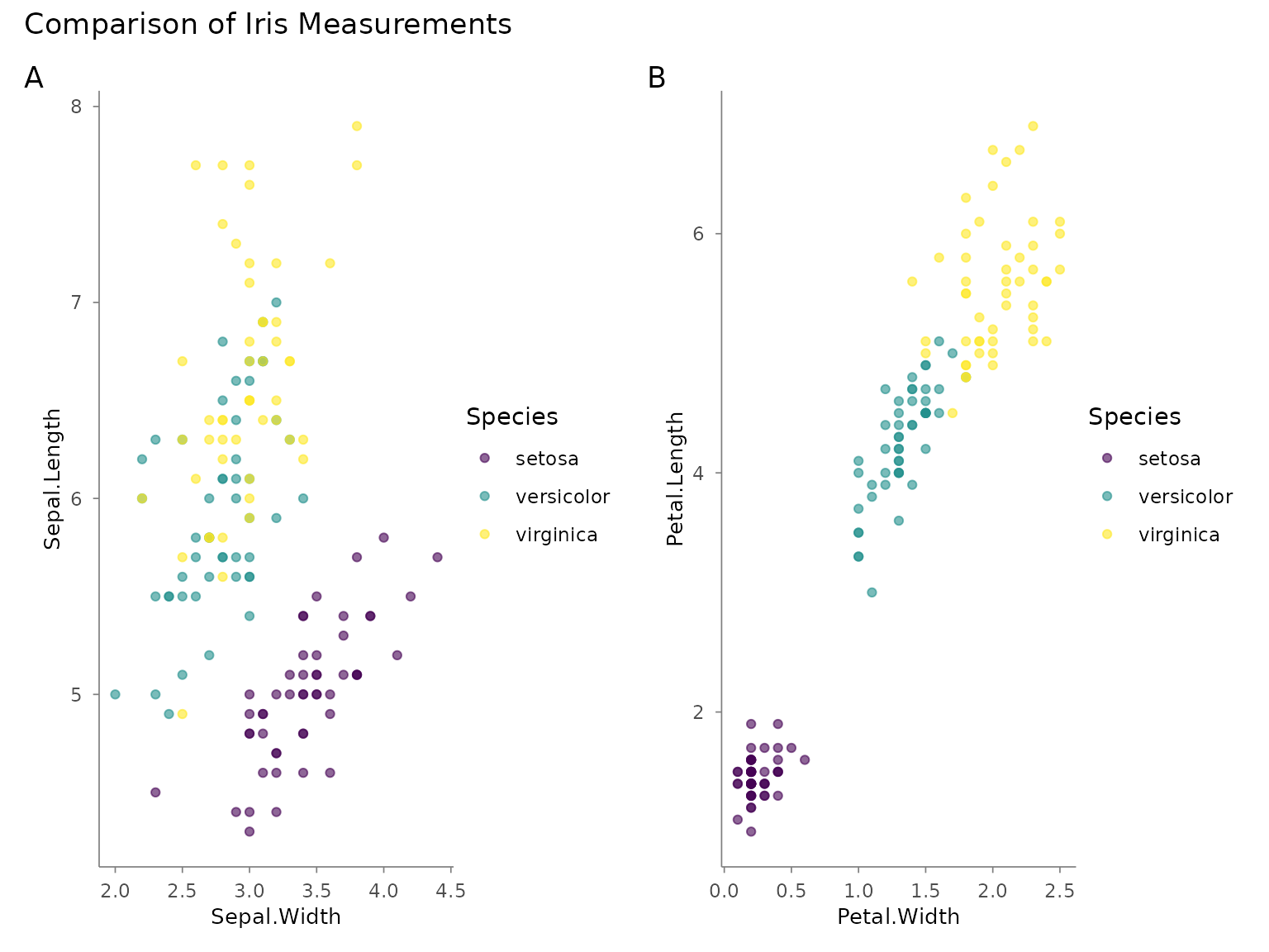
Supported tag schemes: "A" (uppercase), "a"
(lowercase), "1" (numbers), "i" (roman
numerals), or custom character vectors like
c("(a)", "(b)").
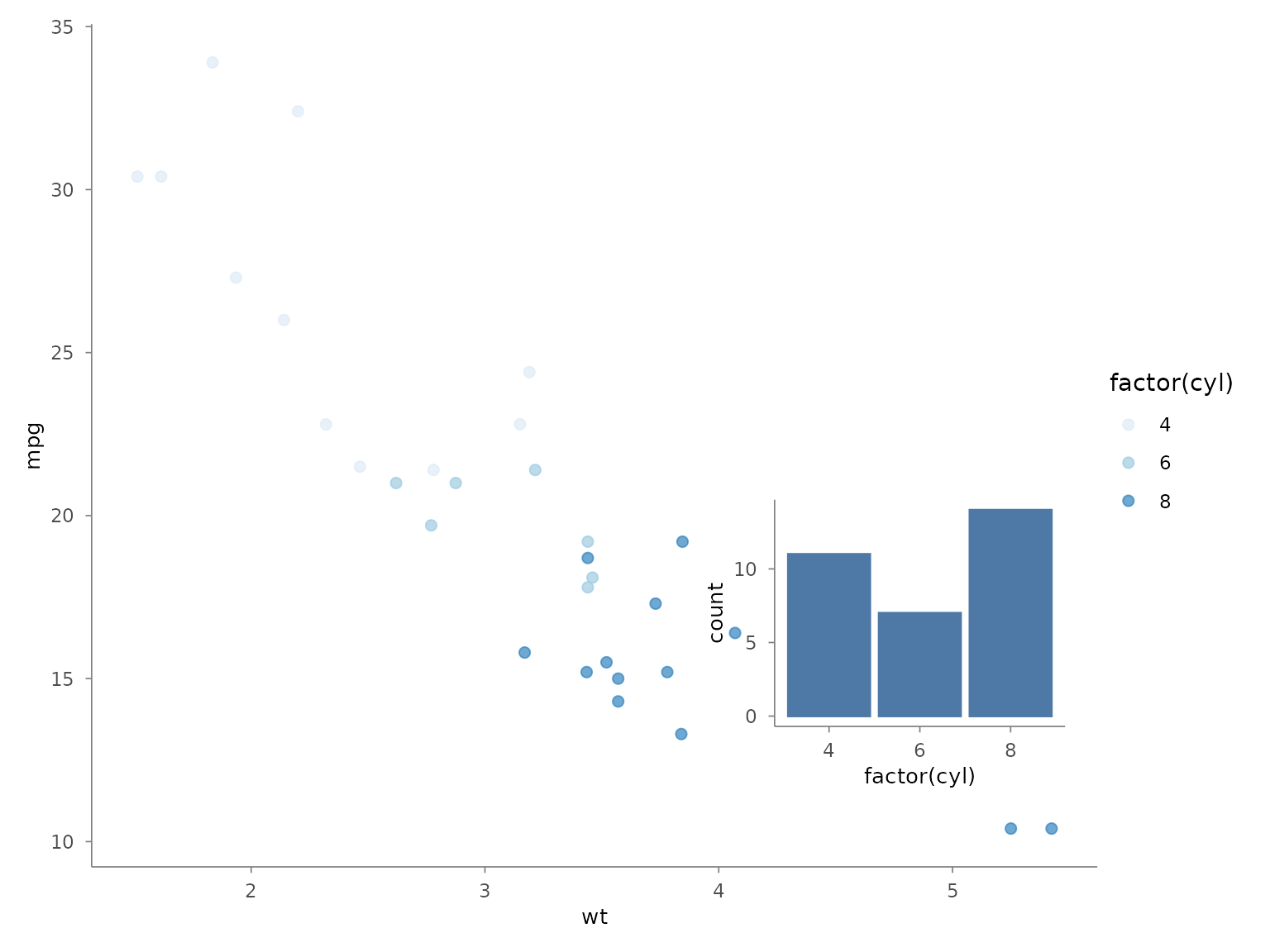
compose_inset() — Floating Overlay
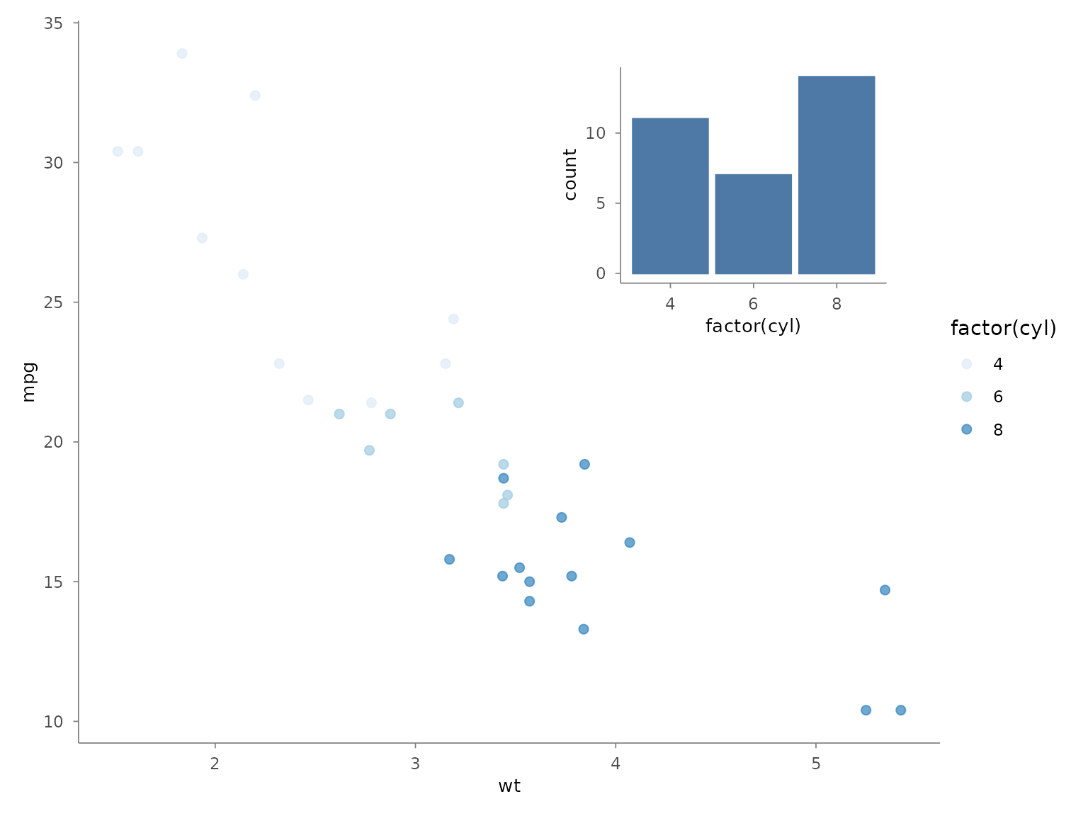
Place a smaller plot as an overlay on a base plot. Position is specified in normalised parent coordinates (0–1).
base <- mtcars |>
  plotit(encode(x = wt, y = mpg, colour = factor(cyl))) |>
  mark_point(size = 2, alpha = 0.7) |>
  scale_color(range = "brewer") |>
  label_title("Weight vs MPG")
#> Scale for colour is already present.
#> Adding another scale for colour, which will replace the existing scale.

inset <- mtcars |>
  plotit(encode(x = factor(cyl))) |>
  mark_bar() |>
  label_title("Cylinders")

# Place inset in the top-right corner
compose_inset(base, inset,
  left = 0.55, bottom = 0.55, right = 0.95, top = 0.95
)
# Larger inset with panel alignment
compose_inset(base, inset,
  left = 0.60, bottom = 0.08, right = 0.98, top = 0.45,
  align_to = "panel"
)
compose_marginal() — Scatter + Distributions
Create a scatter plot with marginal histogram or density plots on the top (x-axis) and right (y-axis). Axes are shared so bins align perfectly.
main <- iris |>
  plotit(encode(x = Sepal.Width, y = Sepal.Length, colour = Species)) |>
  mark_point(alpha = 0.6) |>
  scale_color(range = "viridis") |>
  label_title("")
#> Scale for colour is already present.
#> Adding another scale for colour, which will replace the existing scale.

top <- iris |>
  plotit(encode(x = Sepal.Width, fill = Species)) |>
  mark_histogram(bins = 20, alpha = 0.4) |>
  scale_fill(range = "viridis")
#> Scale for fill is already present.
#> Adding another scale for fill, which will replace the existing scale.

right <- iris |>
  plotit(encode(x = Sepal.Length, fill = Species)) |>
  mark_histogram(bins = 20, alpha = 0.4) |>
  scale_fill(range = "viridis") |>
  project_cartesian(flip = TRUE)
#> Scale for fill is already present.
#> Adding another scale for fill, which will replace the existing scale.

compose_marginal(main, top, right) |>
  label_title("Iris Sepal Measurements with Marginal Distributions")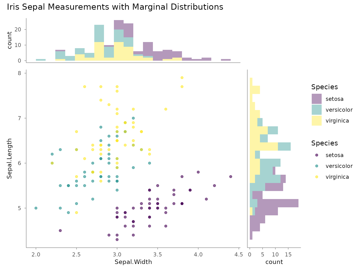
Adjusting Proportions
Control the relative size of marginal panels with widths
and heights:
# Larger marginals
compose_marginal(main, top, right, widths = c(3, 1), heights = c(1, 3)) |>
  label_title("Iris Sepal Measurements")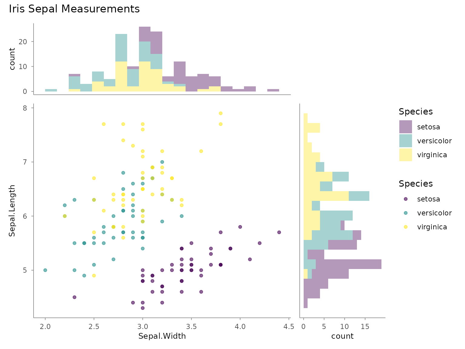
Composing Composites
compose_grid() accepts plotit_composite
objects, so you can nest compositions:
# Create a composite of the scatter + marginals
scatter_with_marginals <- compose_marginal(main, top, right)

# Create a standalone boxplot
box <- iris |>
  plotit(encode(x = Species, y = Sepal.Length, fill = Species)) |>
  mark_boxplot() |>
  scale_fill(range = "brewer") |>
  label_title("By Species")
#> Scale for fill is already present.
#> Adding another scale for fill, which will replace the existing scale.

# Combine them
compose_grid(scatter_with_marginals, box, widths = c(3, 1)) |>
  label_title("Iris Dataset: Two Views") |>
  label_caption("Anderson's Iris Data, 1935")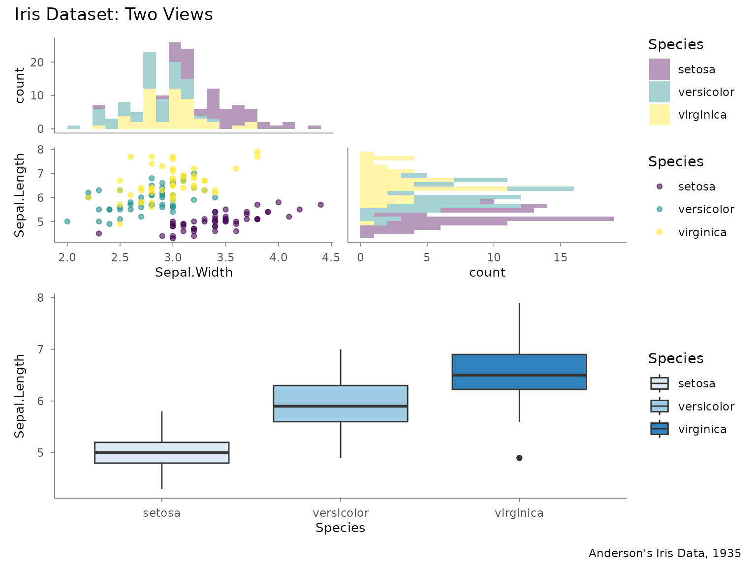
Exporting Composites
Composite objects are exported the same way as single plots:
dashboard <- compose_grid(p1, p2, p3, p4, ncol = 2, tag_levels = "A") |>
  label_title("Dashboard") |>
  style(base_theme = ggplot2::theme_minimal(base_size = 12))

export(dashboard, "dashboard.png", width = 12, height = 8, dpi = 300)
What’s Not Supported on Composites
Operations that modify individual plots (mark_*(),
scale_*(), project_*(),
split_*(), label_axis(),
label_legend()) are not supported on composite objects.
Build and style each sub-plot before composing.