Adds a filled area layer. With y mapped this is a classic
(optionally stacked) area chart via geom_area; with ymin/ymax
mapped instead it becomes an interval band via geom_ribbon <U+2014>
confidence bands, min/max envelopes, or any "area between two
curves" view (Vega-Lite's area covers both, as does G2).
Usage
mark_area(
  plot,
  mapping = NULL,
  data = NULL,
  position = NULL,
  ...,
  rasterize = FALSE,
  rasterize_dpi = 300,
  rasterize_dev = "cairo"
)
Arguments
- plot
A plotit object
- mapping
Optional new aesthetics
- data
Optional data for this layer
- position
Position adjustment.
- ...
Other arguments passed to
geom_area(orgeom_ribbonwhenymin/ymaxdrive the layer)- rasterize
If
TRUE, rasterize viaggrastr::rasterise().- rasterize_dpi
DPI for rasterization (default 300).
- rasterize_dev
Graphics device for rasterization (default
"cairo").
Examples
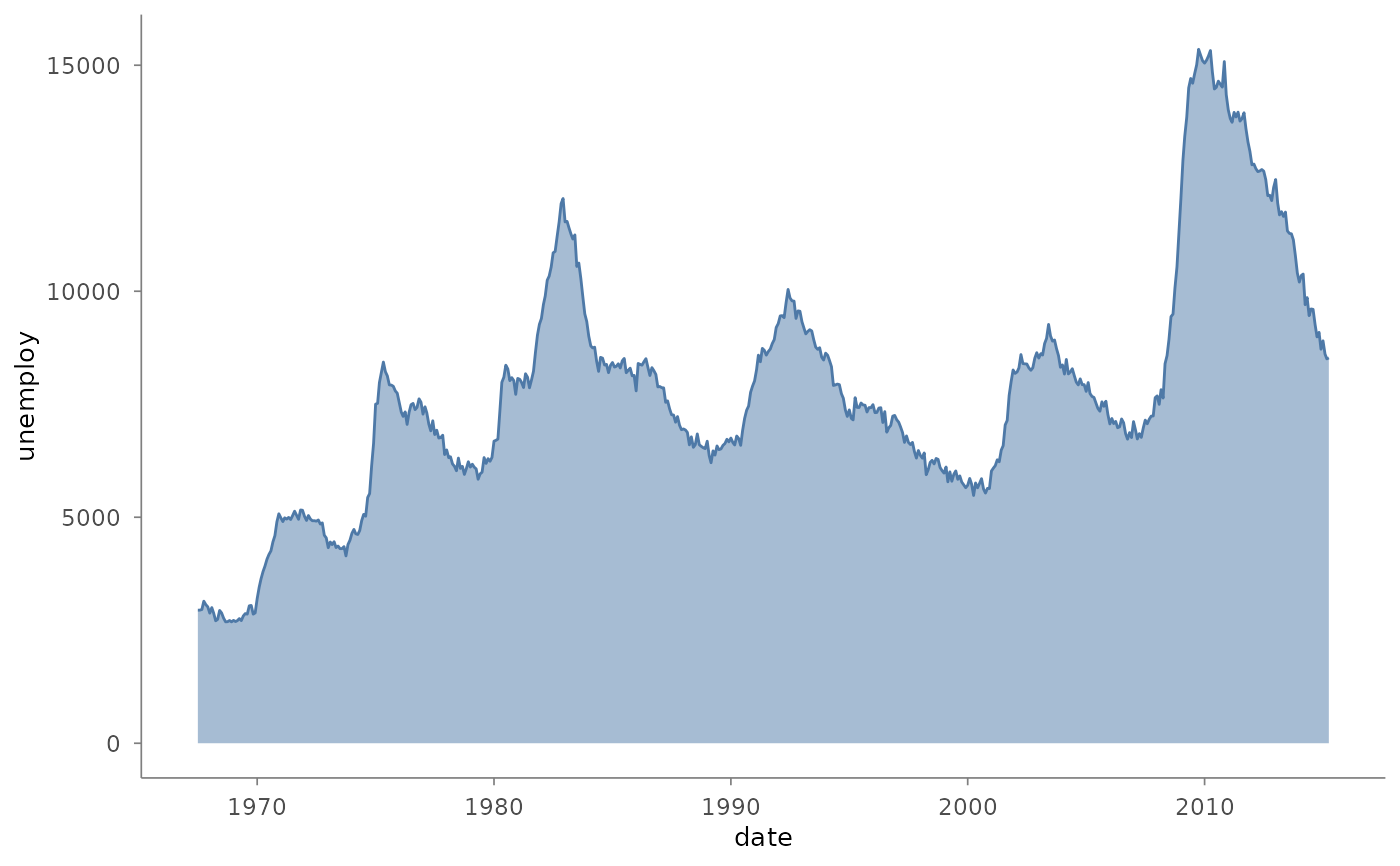
plotit(ggplot2::economics, encode(x = date, y = unemploy)) |>
mark_area(alpha = 0.5)
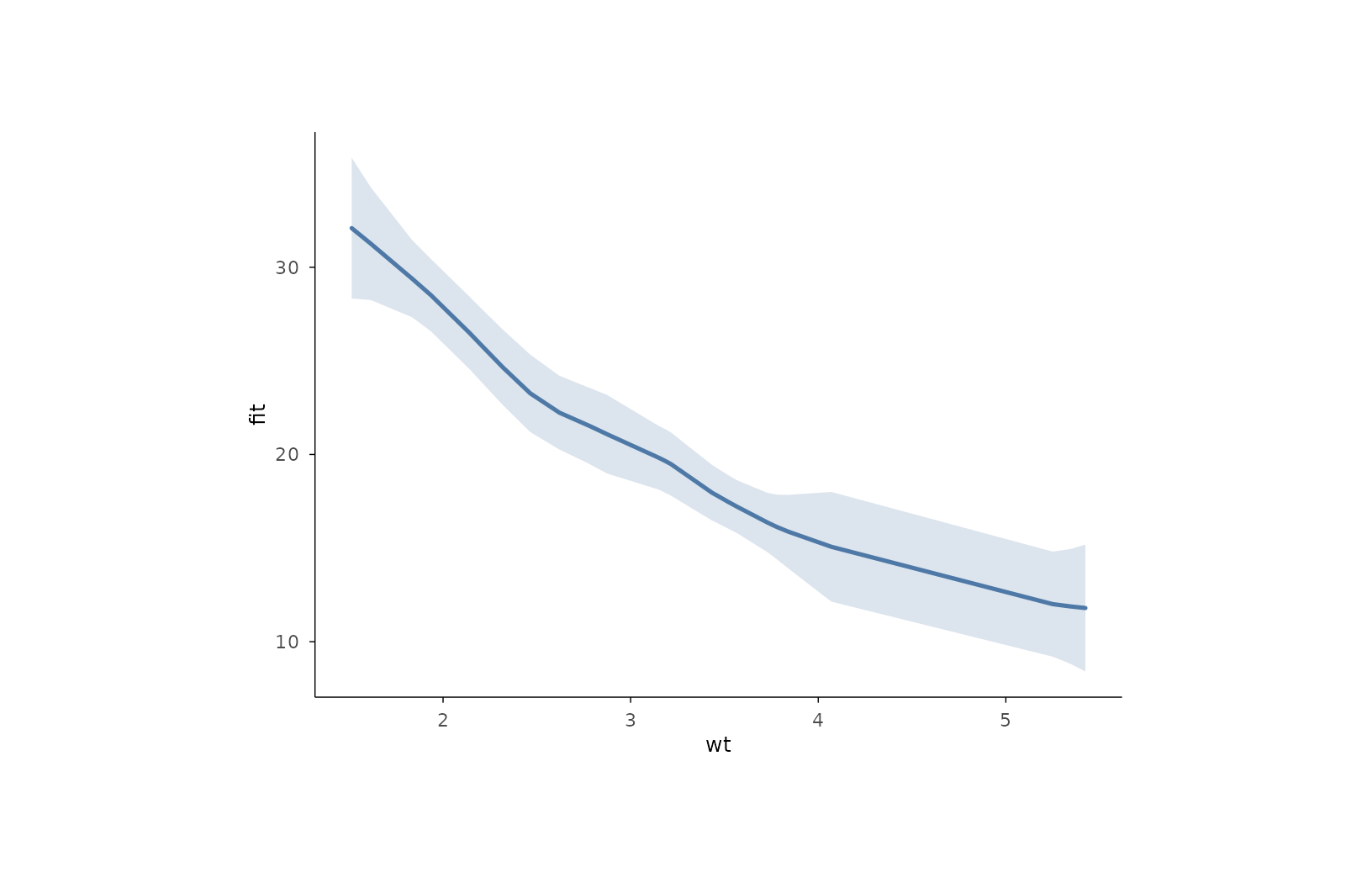
 # interval band: smooth fit with 95% confidence envelope
fit <- stats::loess(mpg ~ wt, data = mtcars)
band <- data.frame(
wt = mtcars$wt,
fit = stats::predict(fit),
se = stats::predict(fit, se = TRUE)$se.fit
)
band$lo <- band$fit - 1.96 * band$se
band$hi <- band$fit + 1.96 * band$se
plotit(band, encode(x = wt, ymin = lo, ymax = hi)) |>
mark_area(alpha = 0.2, fill = "#4E79A7") |>
mark_line(mapping = encode(x = wt, y = fit))
# interval band: smooth fit with 95% confidence envelope
fit <- stats::loess(mpg ~ wt, data = mtcars)
band <- data.frame(
wt = mtcars$wt,
fit = stats::predict(fit),
se = stats::predict(fit, se = TRUE)$se.fit
)
band$lo <- band$fit - 1.96 * band$se
band$hi <- band$fit + 1.96 * band$se
plotit(band, encode(x = wt, ymin = lo, ymax = hi)) |>
mark_area(alpha = 0.2, fill = "#4E79A7") |>
mark_line(mapping = encode(x = wt, y = fit))